Ideas brought to life. Content made to connect.
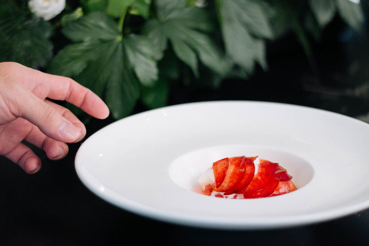 02 · Campaigns & live contentEnd-to-end cultural contentEvent strategy, social assets and photographyView →
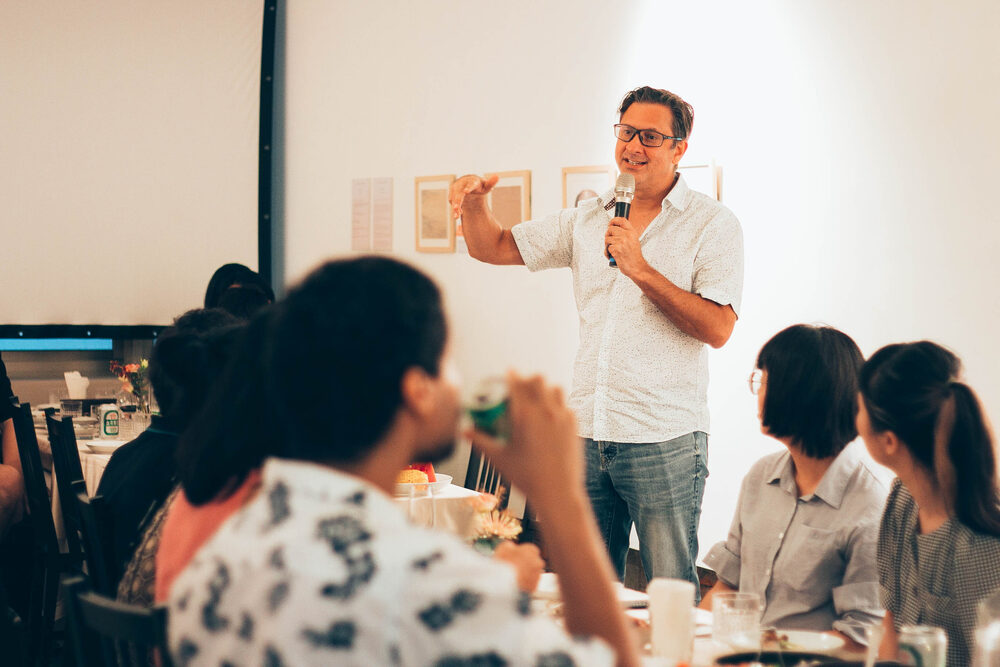 02 · Campaigns & live contentOriginal event photographyReal moments captured for future campaignsView →
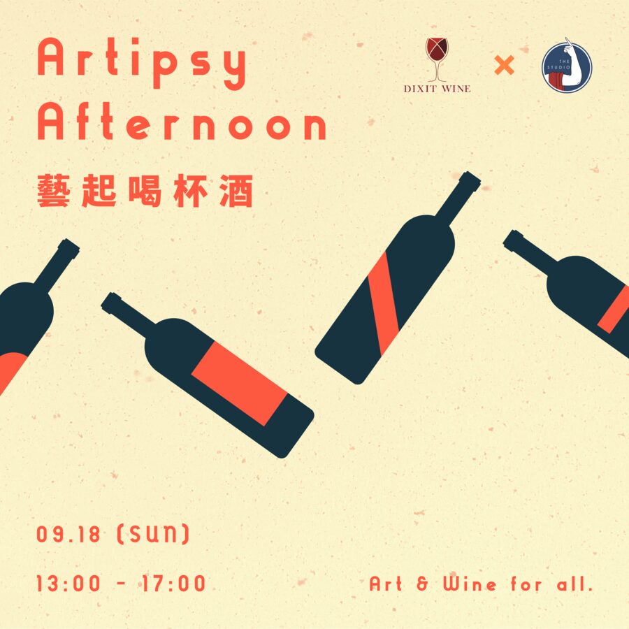 02 · Campaigns & live contentExhibition & event bannersPromotional banners and social assets for each programmeView →
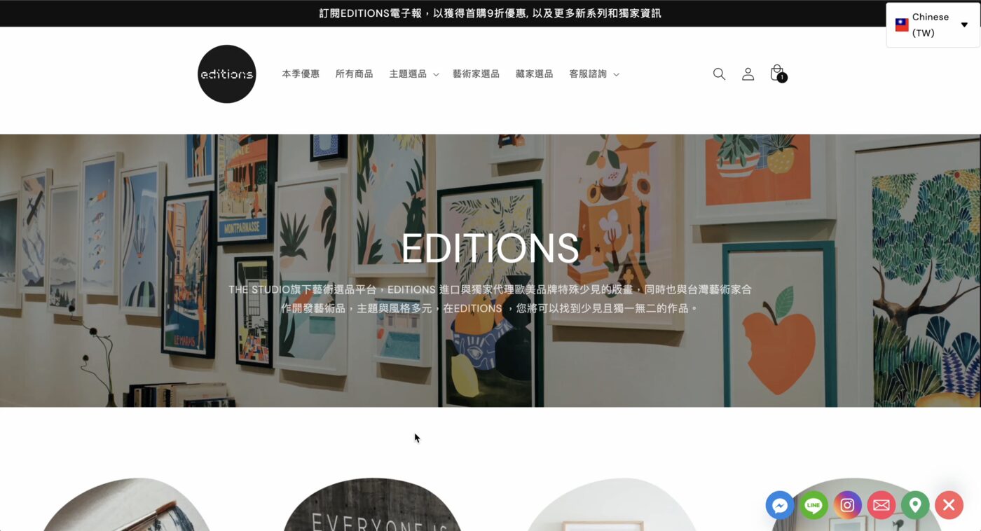 03 · Social, web & growthBilingual campaign ecosystemBuilt end to end; +64% FB, +87% IGView →
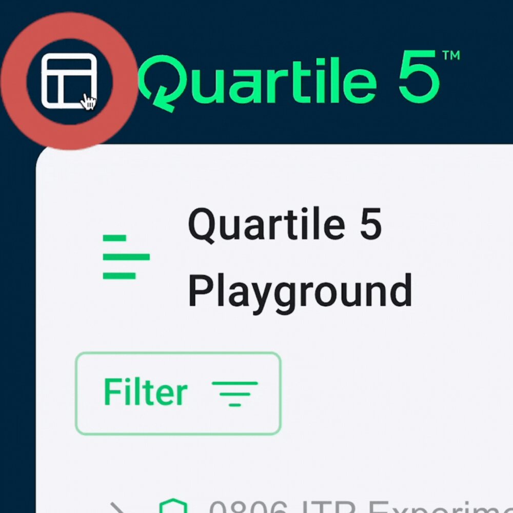 04 · Video & digital contentOnboarding content that changes behaviourGuided flows, animated walkthroughs and articlesView →
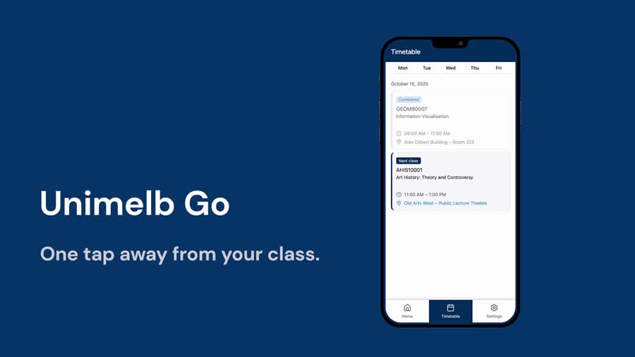 04 · Video & digital contentUnimelb Go — concept filmPremiere Pro edit: pacing, titles and soundView →
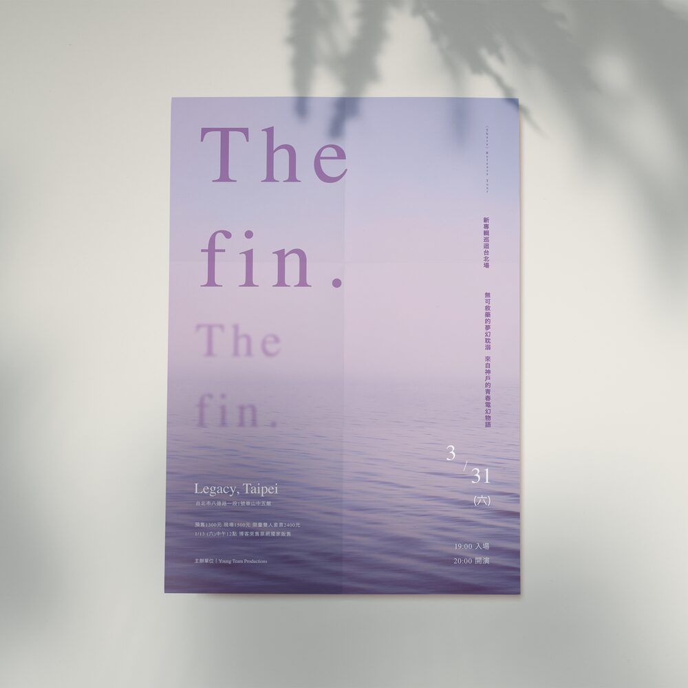 05 · Campaign designCampaign postersOne message, many formats and hierarchiesView →
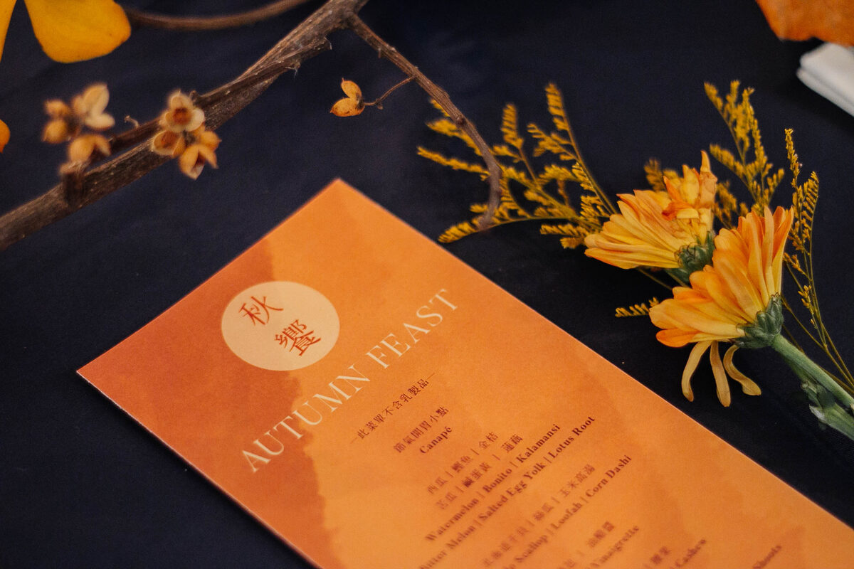 05 · Campaign designBilingual productionTraditional Chinese and English, designed to printView →
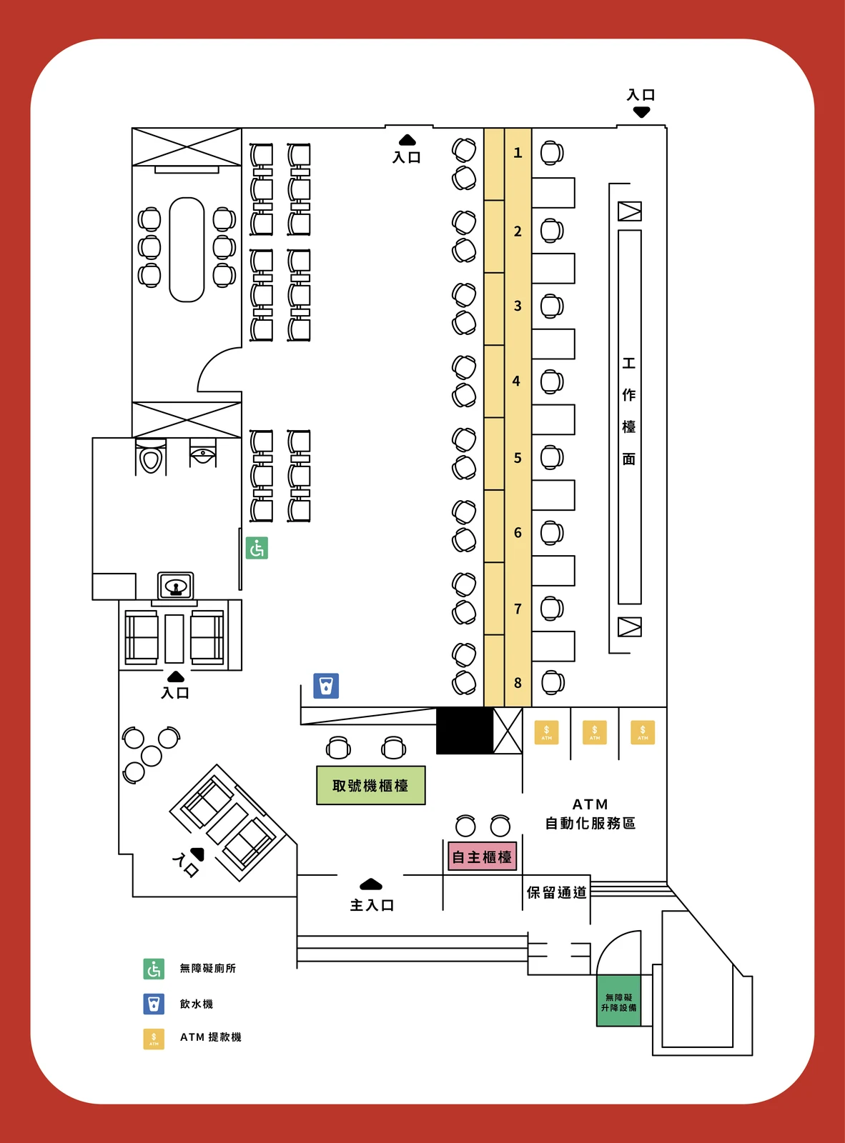 06 · Accessible contentTactile map artworkClear visual instructions designed for touchView →
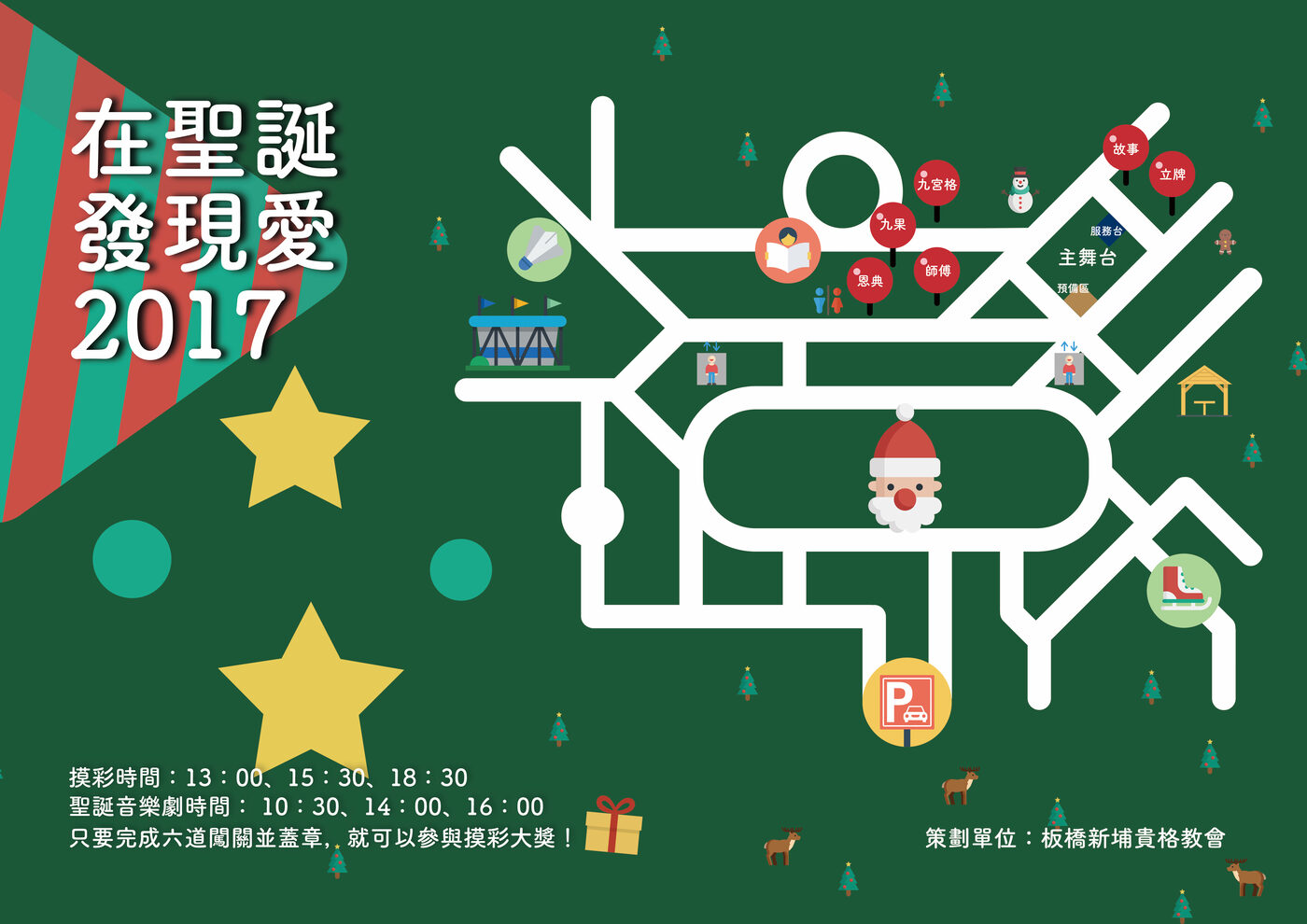 06 · Accessible contentEvent guidance mapInformation understood while movingView →
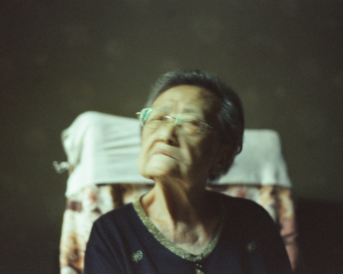 07 · Visual storytellingDocumentary photographyQuiet stories built from observationView →
I'm Chris — a Melbourne-based bilingual Content Creator working across video, photography, social media, web and campaign design in English and Traditional Chinese.
My background in Radio & Television taught me to build stories through image, pacing and sound. At THE STUDIO in Taipei — a hybrid private-dining and contemporary-art venue — I took bilingual content from brief to publication: planning campaigns, writing bilingual copy, photographing dishes, dining spaces and live events, designing campaign visuals, building web and e-commerce pages, and keeping every touchpoint visually consistent.
I also bring a Master of Information Systems and product-analysis experience. That means I do more than make content look good: I understand how people move through content, find where they get stuck, use the results to improve the next version, and turn one-off ideas into repeatable content systems.
Cultural programmes, turned into content.
THE STUDIO, Taipei · Hybrid private dining & contemporary art venue · 2022–2023
For a year I led bilingual content and campaign delivery for THE STUDIO, a hybrid private-dining and contemporary-art venue in Taipei — five exhibitions and 15+ art dinners, workshops, talks and tasting events for 300+ guests. Every project gave me a complete story to shape: the artist and idea, the invitation, the dining or live experience, and the content that extended its reach afterwards.
For each campaign I translated the concept into a consistent set of touchpoints: bilingual copy, posters, social graphics, email campaigns, web updates and original event photography. I adapted the message to each format while keeping one recognisable voice and visual system.
I also handled the production behind the content — artist and partner coordination, schedules, workshops, talks and dinners — so the material I published came from direct knowledge of the people, context and audience rather than a second-hand brief.
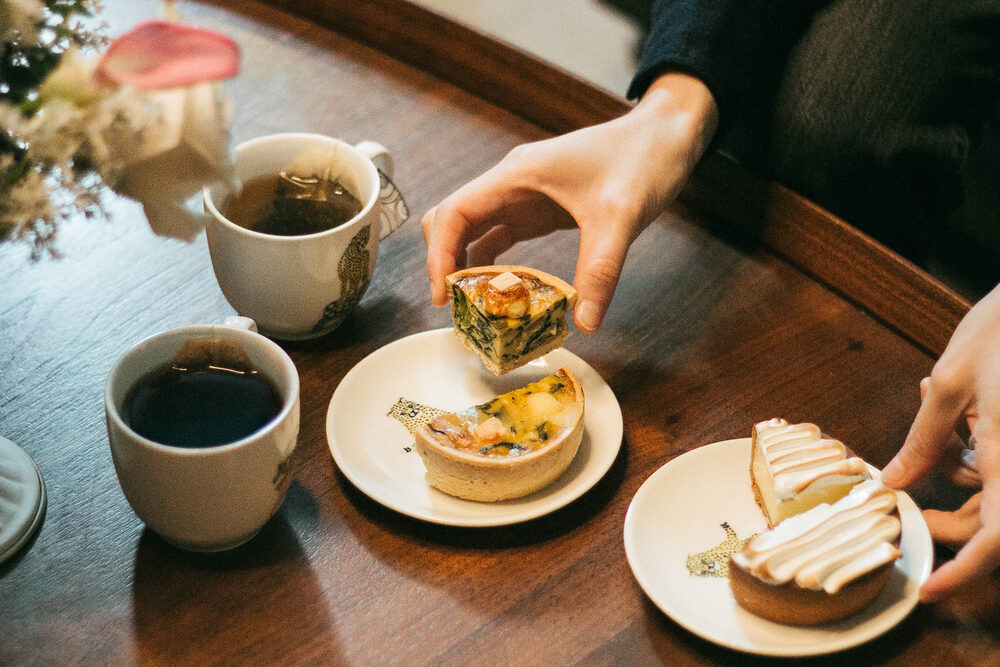
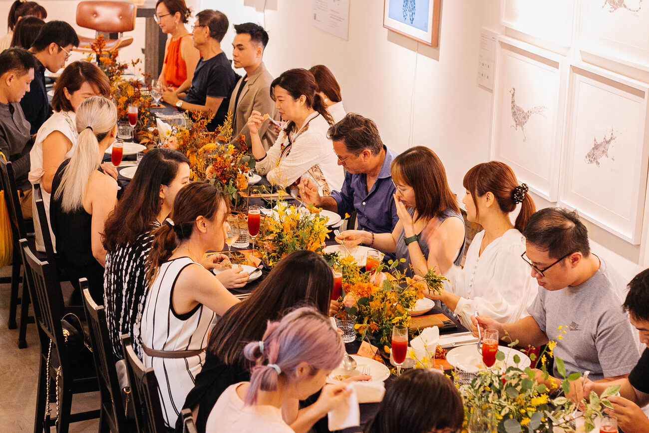
Workshops, talks, dinners, exhibitions and tastings — I produced and photographed them as they happened. The resulting image library gave future campaigns authentic material instead of stock imagery and made each event feed the next.
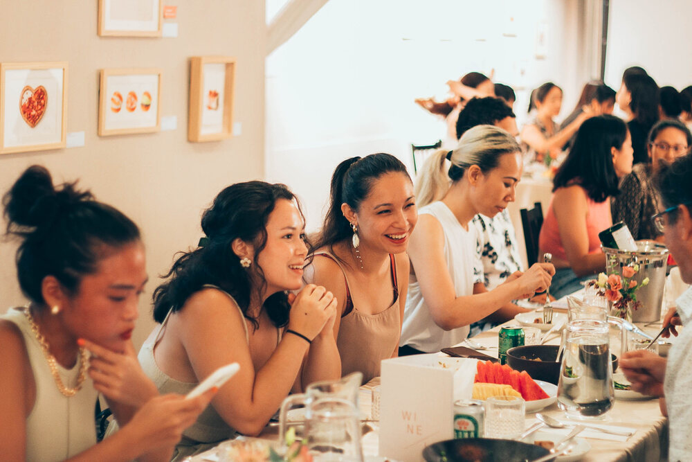
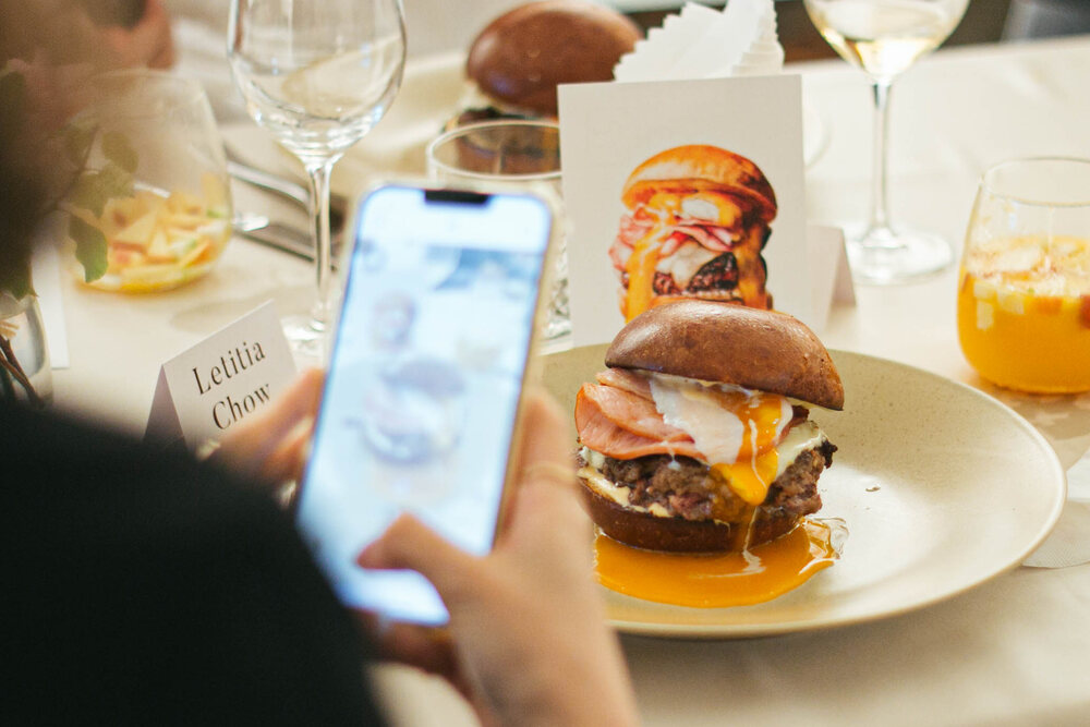
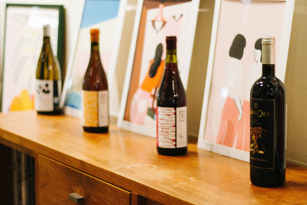
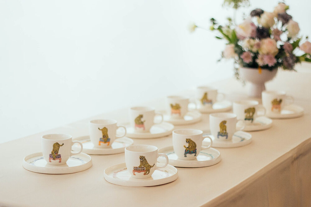
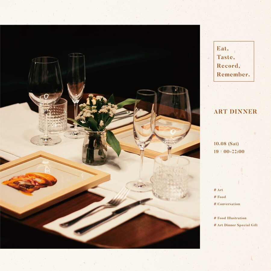
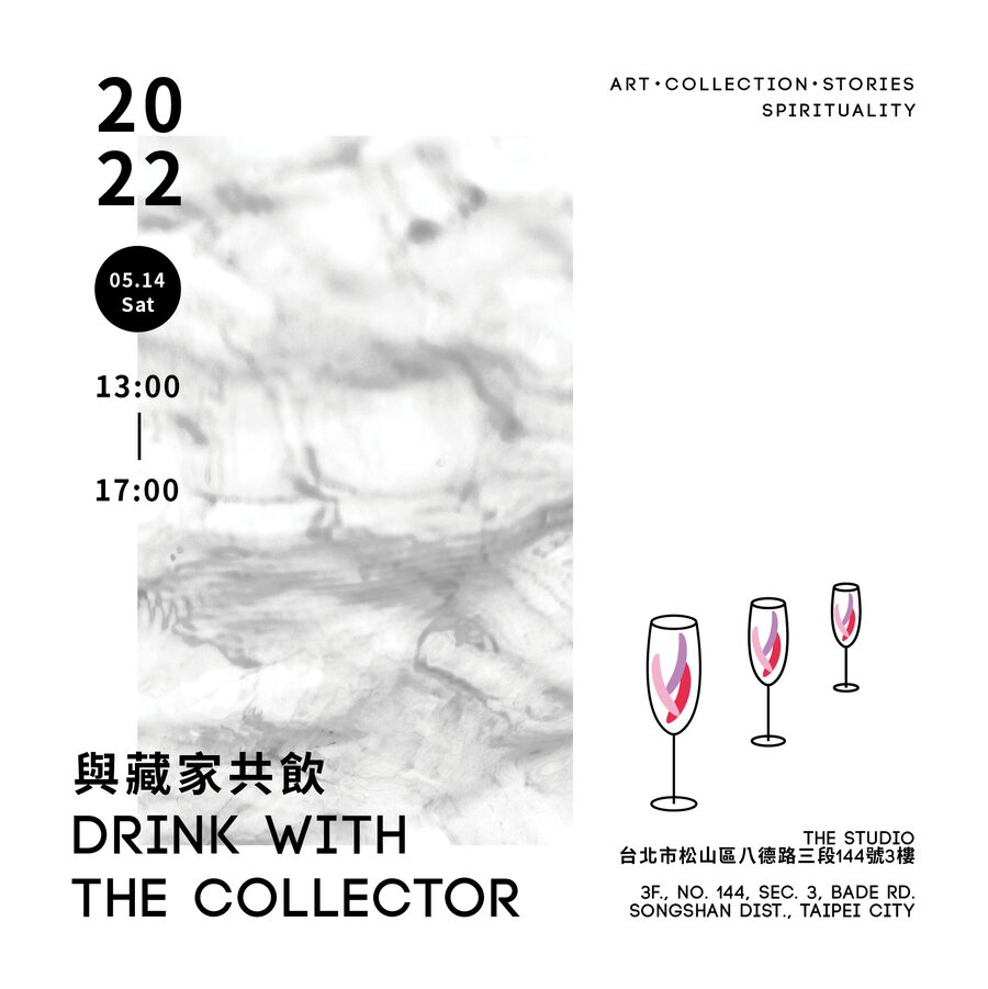
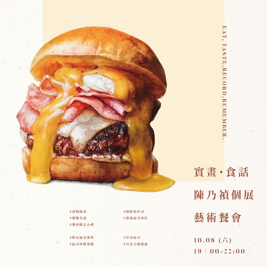
These promotional banners were created for exhibitions and related events, including art dinners, wine tastings and collector gatherings. Each was adapted for online promotion and social media.
Bilingual content that drives growth.
EDITIONS by THE STUDIO · Taipei · 2022–2023
Alongside the programme I managed the gallery's content channels: Instagram, Facebook, email campaigns, a Wix website and bilingual product pages. I wrote and designed in English and Traditional Chinese, adapting tone and hierarchy so the same idea remained clear across languages and formats.
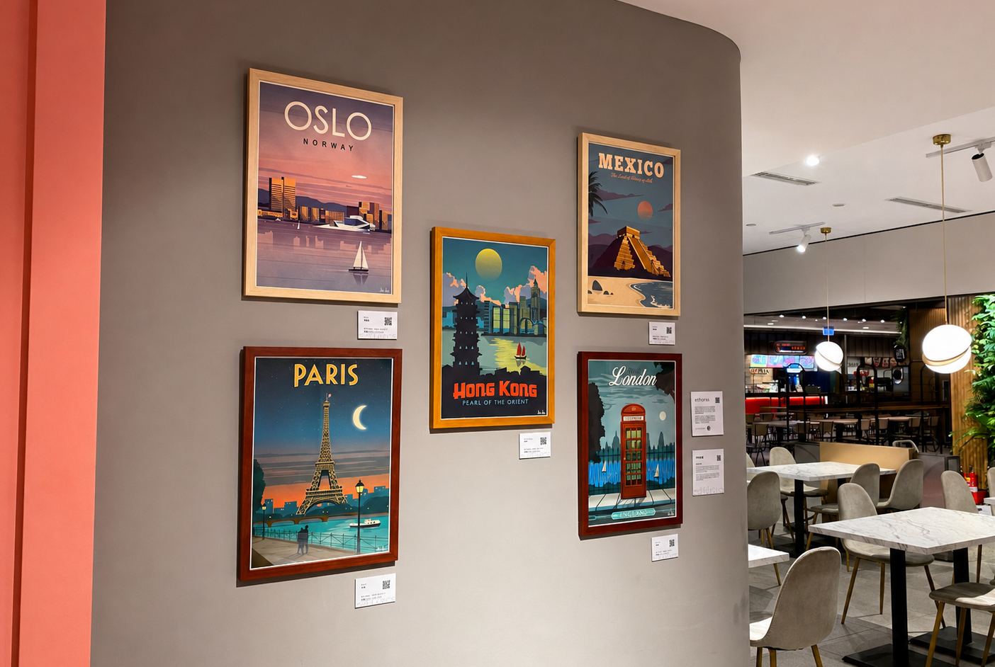
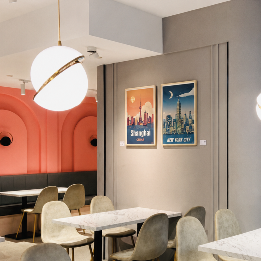
I established EDITIONS, the gallery's art-print brand, and built its Shopify store end to end. Product photography and room mock-ups helped customers understand scale and context; editorial emails connected individual prints to interior styles; and pop-ups with TSUTAYA BOOKSTORE, Taipei 101 and JustCo extended the campaign into physical spaces.
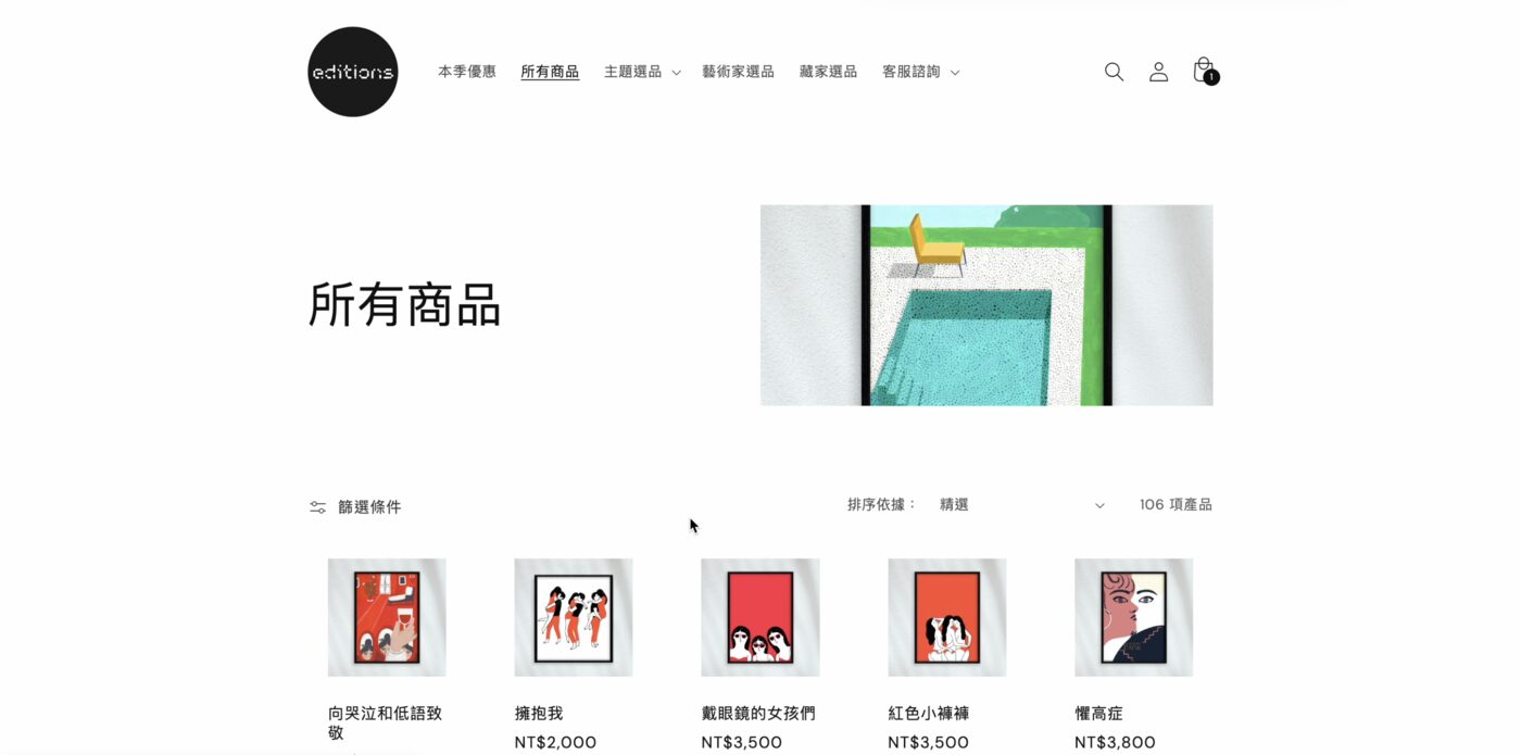
.png)
Art prints are hard to sell flat — a customer needs the scale and the room it belongs in. So I mocked up every print in a range of interiors, matching the frame to the furniture and the light, so someone could picture it on their own wall before buying.
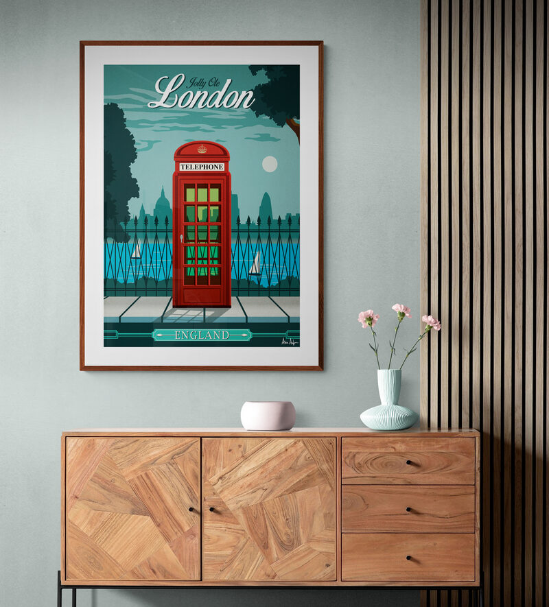
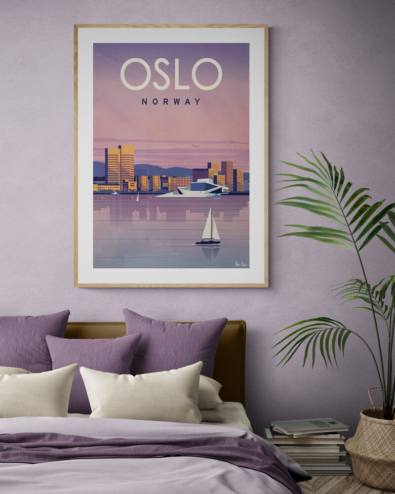
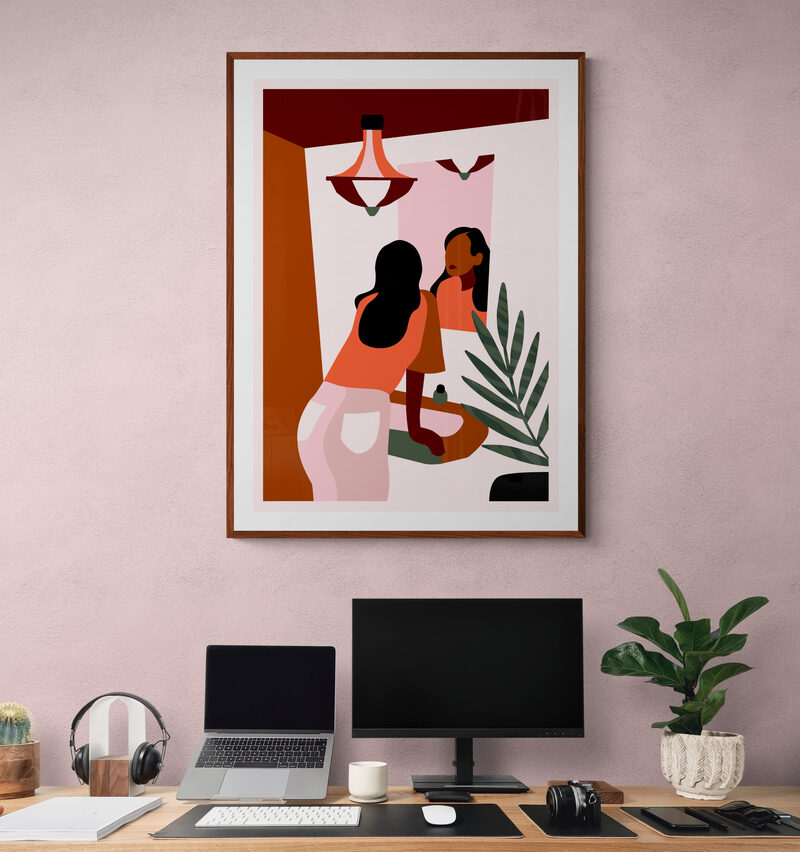
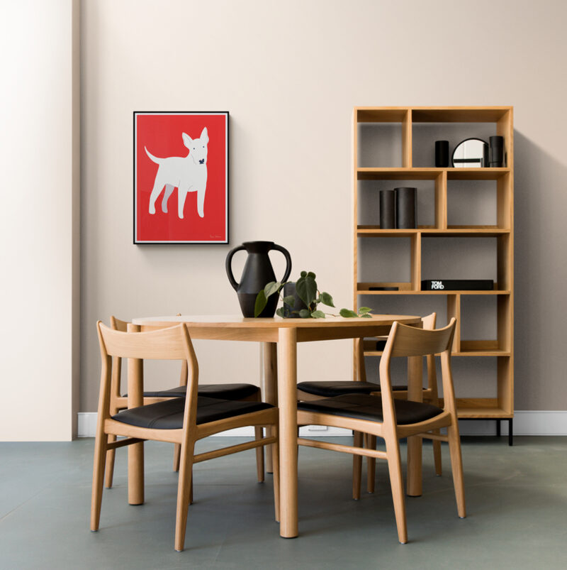
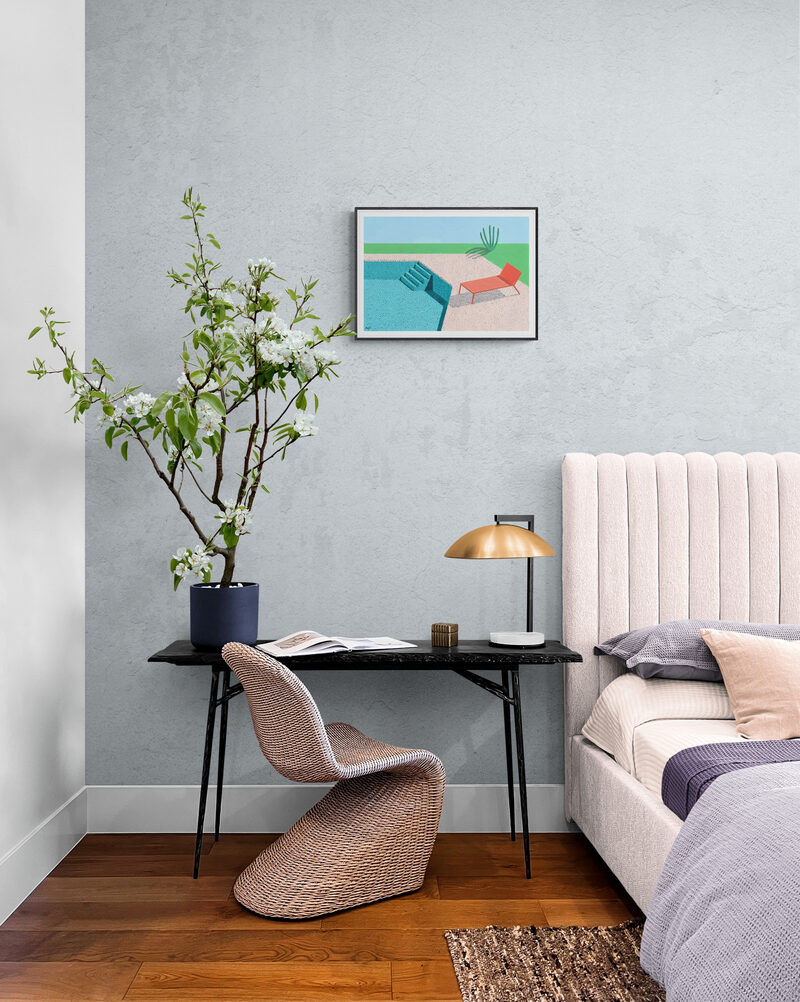
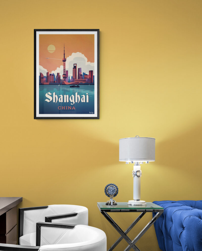
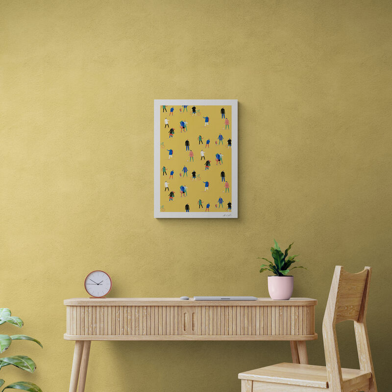
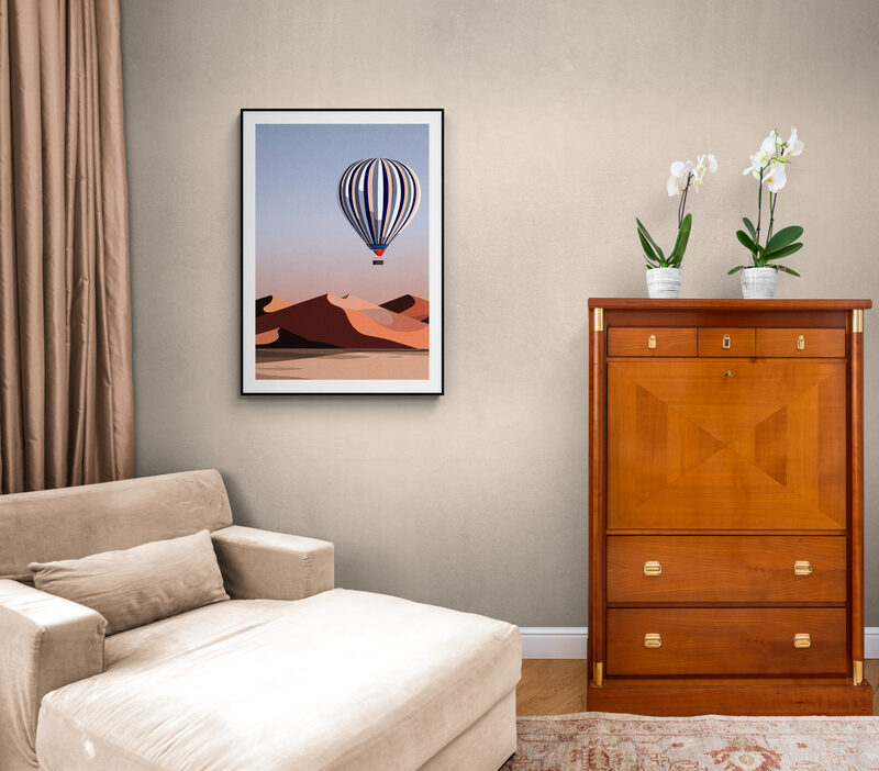
One print dropped into many interiors, kept to a consistent look so the grid reads as one catalogue.
Motion that guides the next step.
Melbourne · concept film, animated walkthroughs and content-led onboarding
My content practice is grounded in audience behaviour. Whether I am editing a concept film or building an in-product walkthrough, I start with the moment a viewer is confused, curious or ready to act, then use pacing, hierarchy and plain language to move them forward. My Master of Information Systems adds research, journey mapping and measurement to that creative process.
Short-form instructional content for an enterprise platform
New customers were opening the product and stalling. I reviewed the full process, documented 15+ places where users got stuck, then created the content response: eight guided task flows with animated screen recordings, 19 help articles and 50+ specifications. The Product Lead estimated the knowledge base could address 90%+ of common early-stage enquiries.
A GIF like this replaces a paragraph. The user doesn't read "open the layout menu in the top left" and then go hunting — they watch it happen once and copy it.
A note on what I can show. The platform is under confidentiality, so this is a single cropped step rather than the full set of eight flows or anything carrying customer data. Happy to talk through the process, the decisions and the results in detail — I just can't publish the screens.
Unimelb Go — campus navigation concept
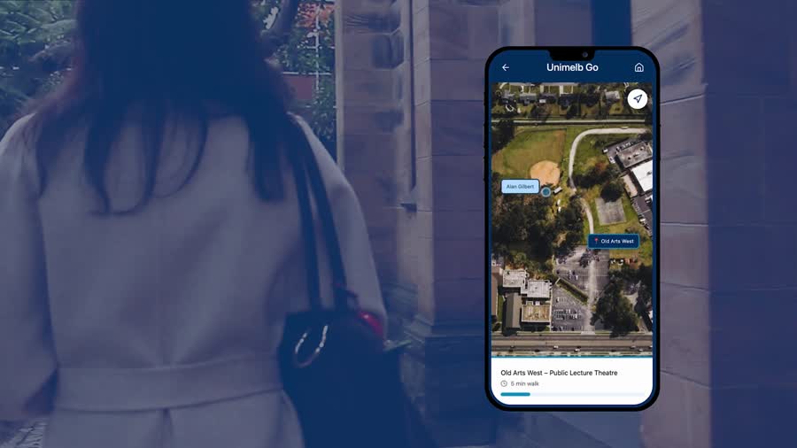
A three-minute concept film for an app that gets a student from their timetable to the right room. I edited it in Adobe Premiere Pro — shaping the cut, pacing, countdown device, on-screen titles and sound into one clear narrative.
It opens on the problem rather than the product: a clock ticking down while someone circles a sandstone building, looking for a lecture theatre the signage won't admit to. The interface only appears once you already want it to.
unimelb_go.mp4, supplied alongside this document.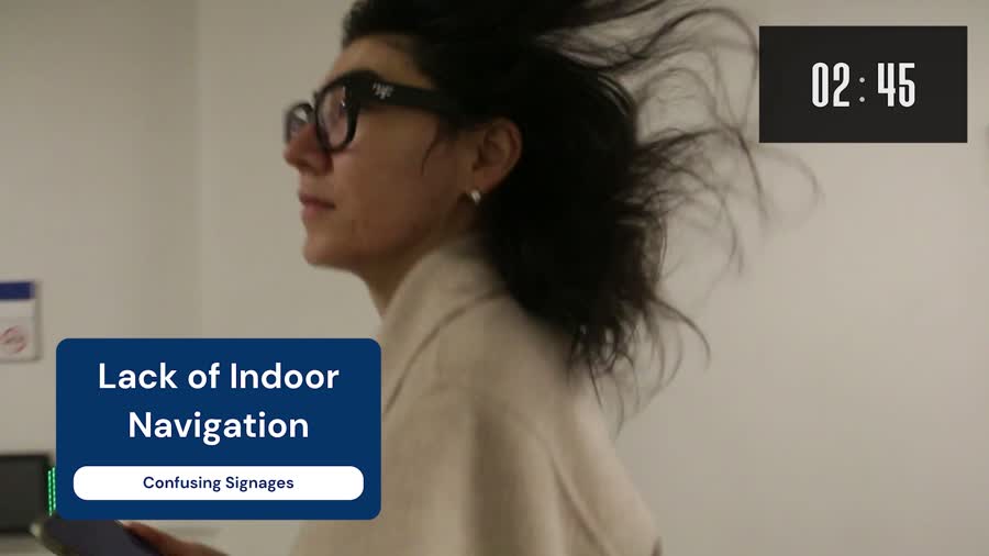
Campaign design across print and digital.
Exhibition posters for THE STUDIO, plus independent and self-initiated pieces
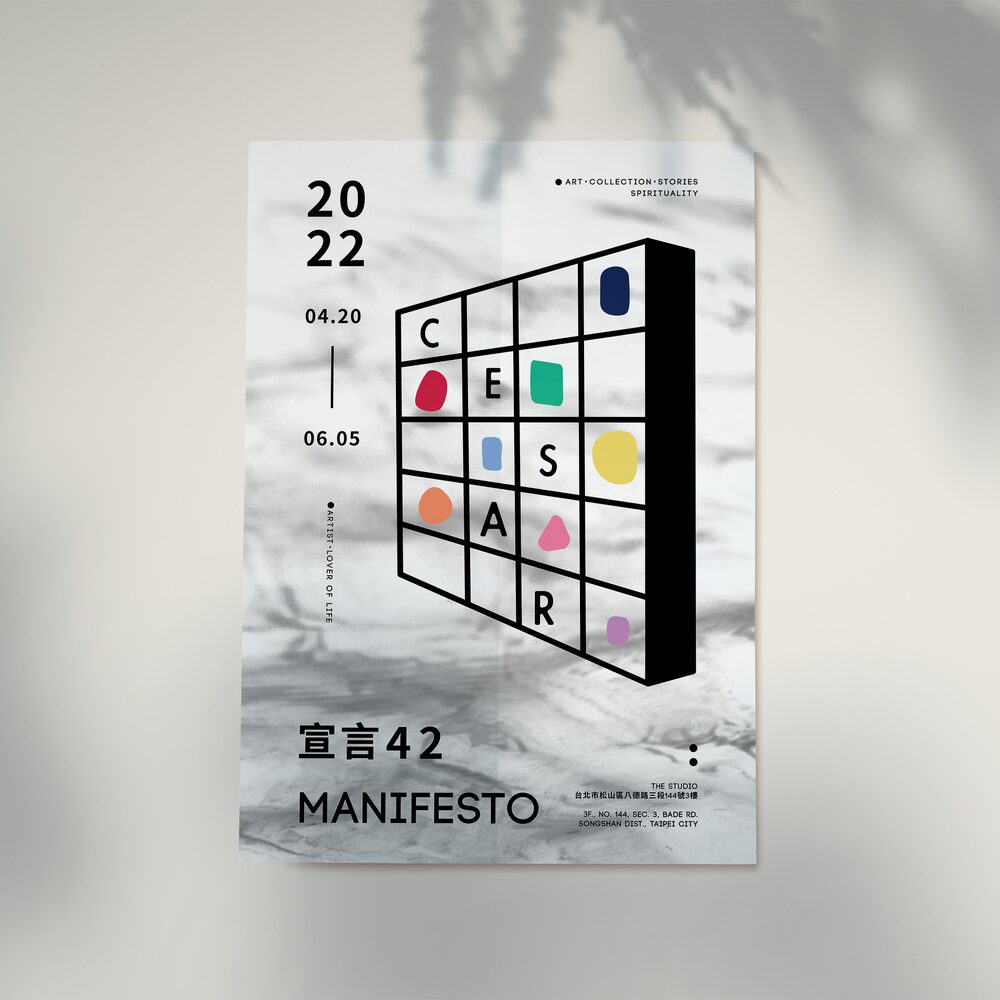
Cesar solo exhibition · THE STUDIO
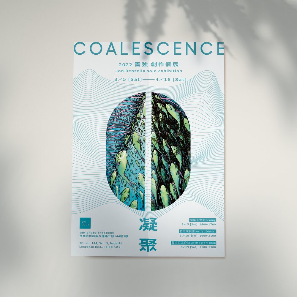
Jon Renzella · EDITIONS by THE STUDIO
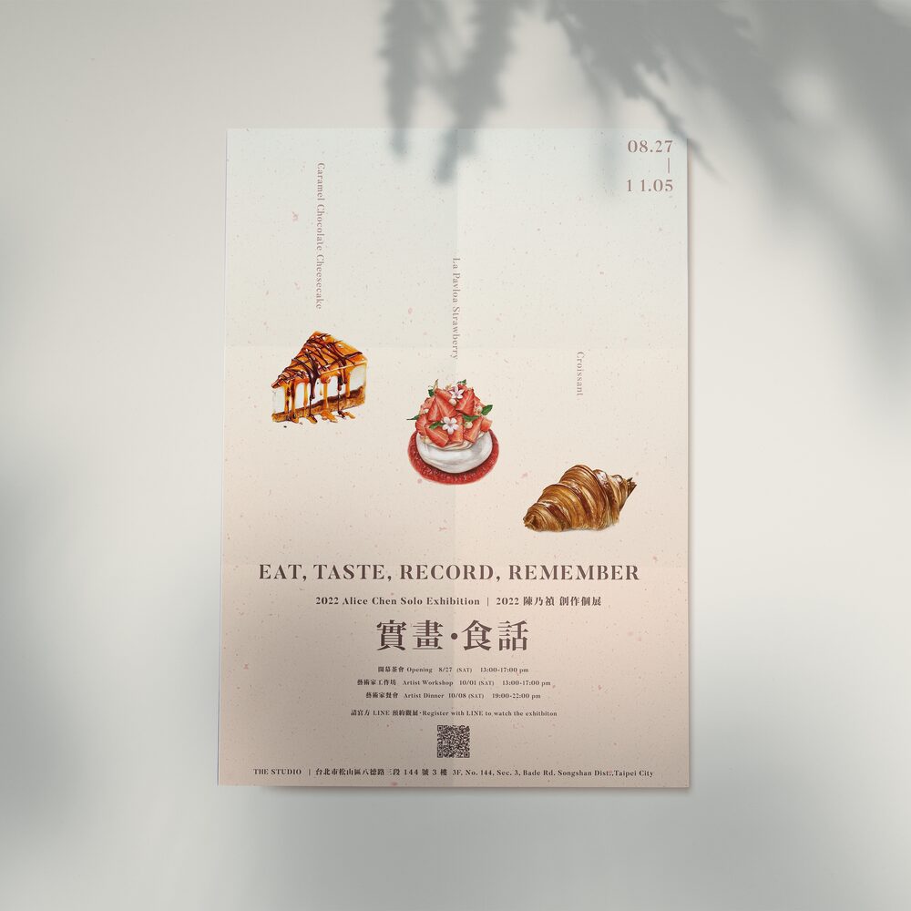
Alice Chen · THE STUDIO
Concert · self-initiated, for fun
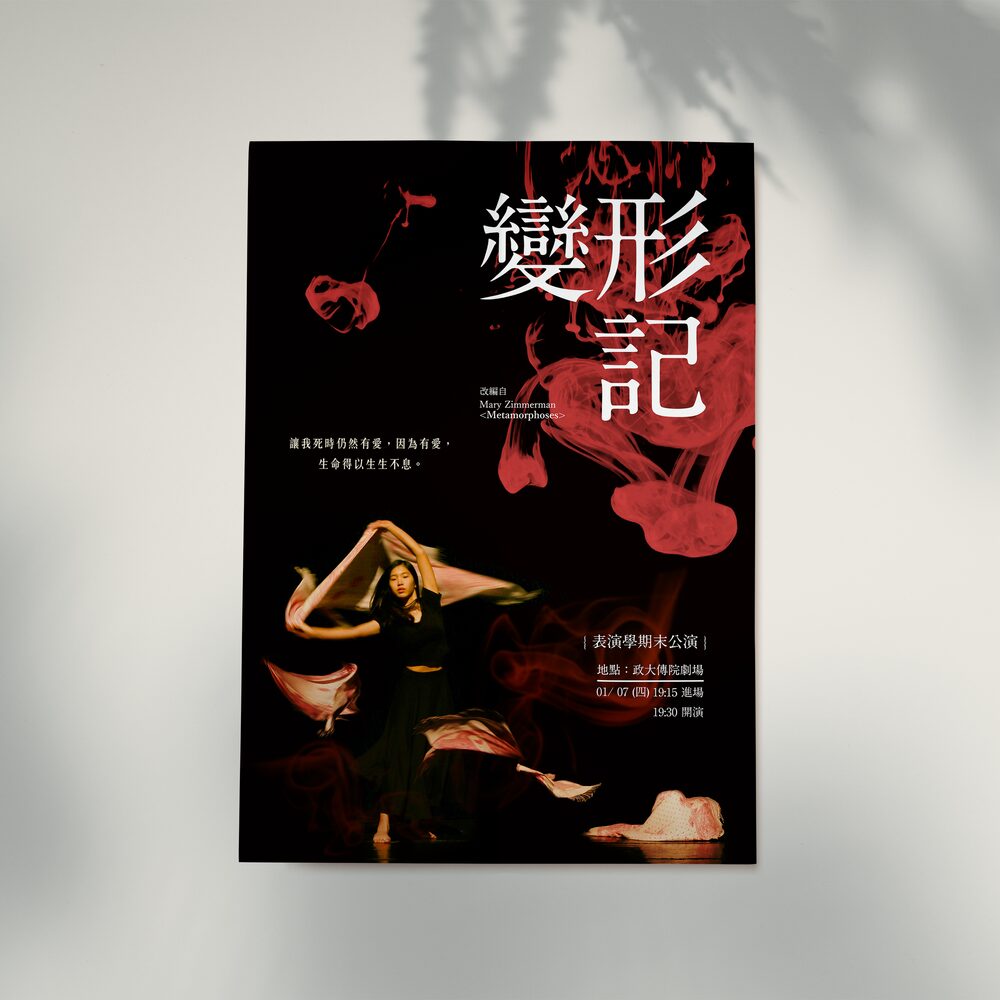
Theatre · independent
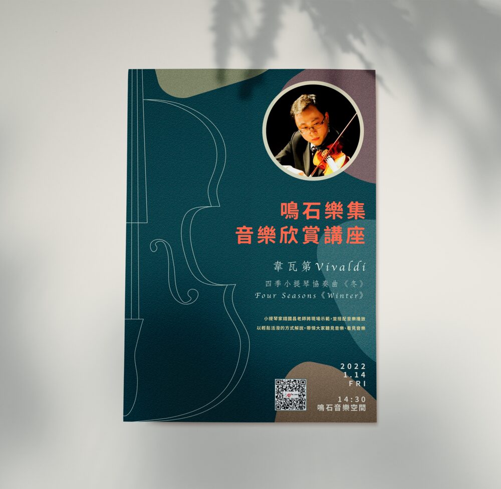
Music lecture · independent
Every one of these carries the same information set — title, dates, session times, venue, address, QR code, organiser lock-up — and the whole job is deciding what a person sees first, second and third. Several are bilingual, with English and Traditional Chinese sharing one layout.
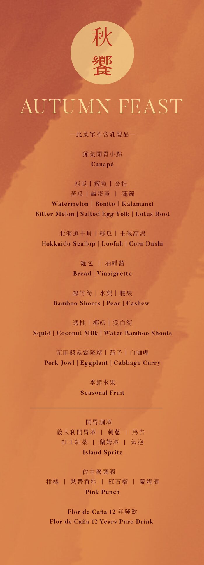
Trim 105 × 297 mm.
The art dinners ran through the year, each with its own printed menu; Autumn Feast is one, shown here as an example. A bilingual tasting menu — every course in Chinese and English, in order, legible in low restaurant light, with any dietary note placed where a guest sees it before the courses.
I set the type, chose the paper, prepared the final file at 105 × 297 mm and sent it to print. The narrow format sits on a set table without crowding the plates, and its terracotta and marigold came from that table.
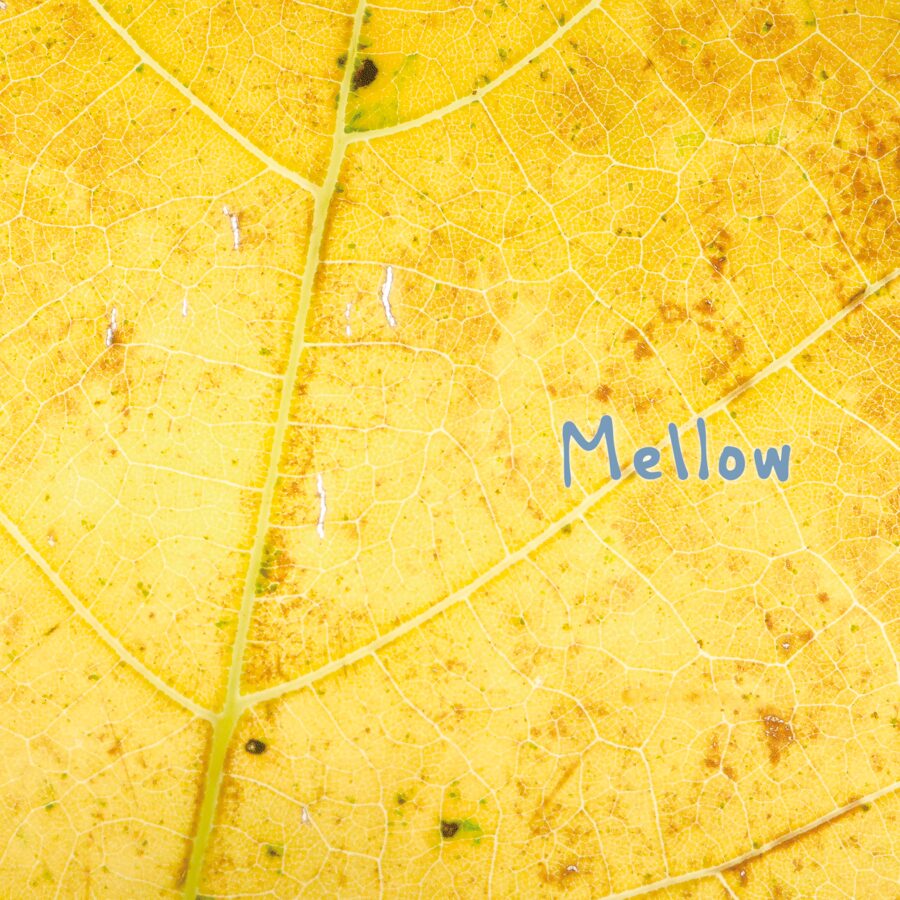
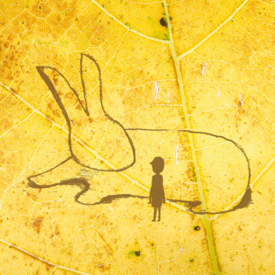
An album sleeve — one continuous artwork that has to survive being folded around an object and still work as a thumbnail. My own macro photograph, hand-lettered title, and an illustration drawn into the same photograph so the two panels read as one wrapped object.
Visual guidance and tactile map design.
Wayfinding and event guidance: maps and diagrams a person has to understand without stopping to study them.
Tactile map artwork
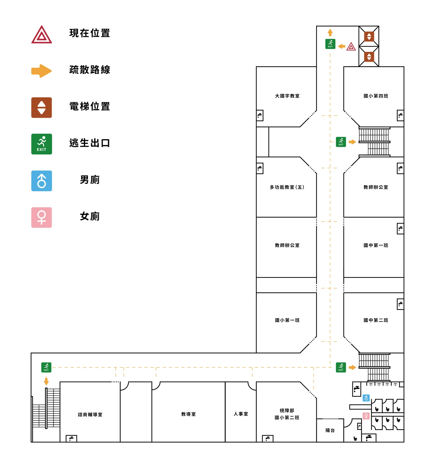
Tactile maps are embossed, not printed — raised lines and surfaces that a blind or low-vision reader traces by hand. My part sits before the machine: I draw the map as clean line work and colour-code every area, so the production technician knows which lines and surfaces to raise. The colours aren't decoration; they're instructions. Two projects: one to get someone out of a building, one to get them to the right counter.
An evacuation route map for a school whose students are blind or low-vision. One continuous dashed route with directional arrows runs from a marked you-are-here point out to the stairwells and exits.
The legend holds six items: current position, evacuation route, lift, fire exit, and the two toilets. Everything else on the sheet is a room label.
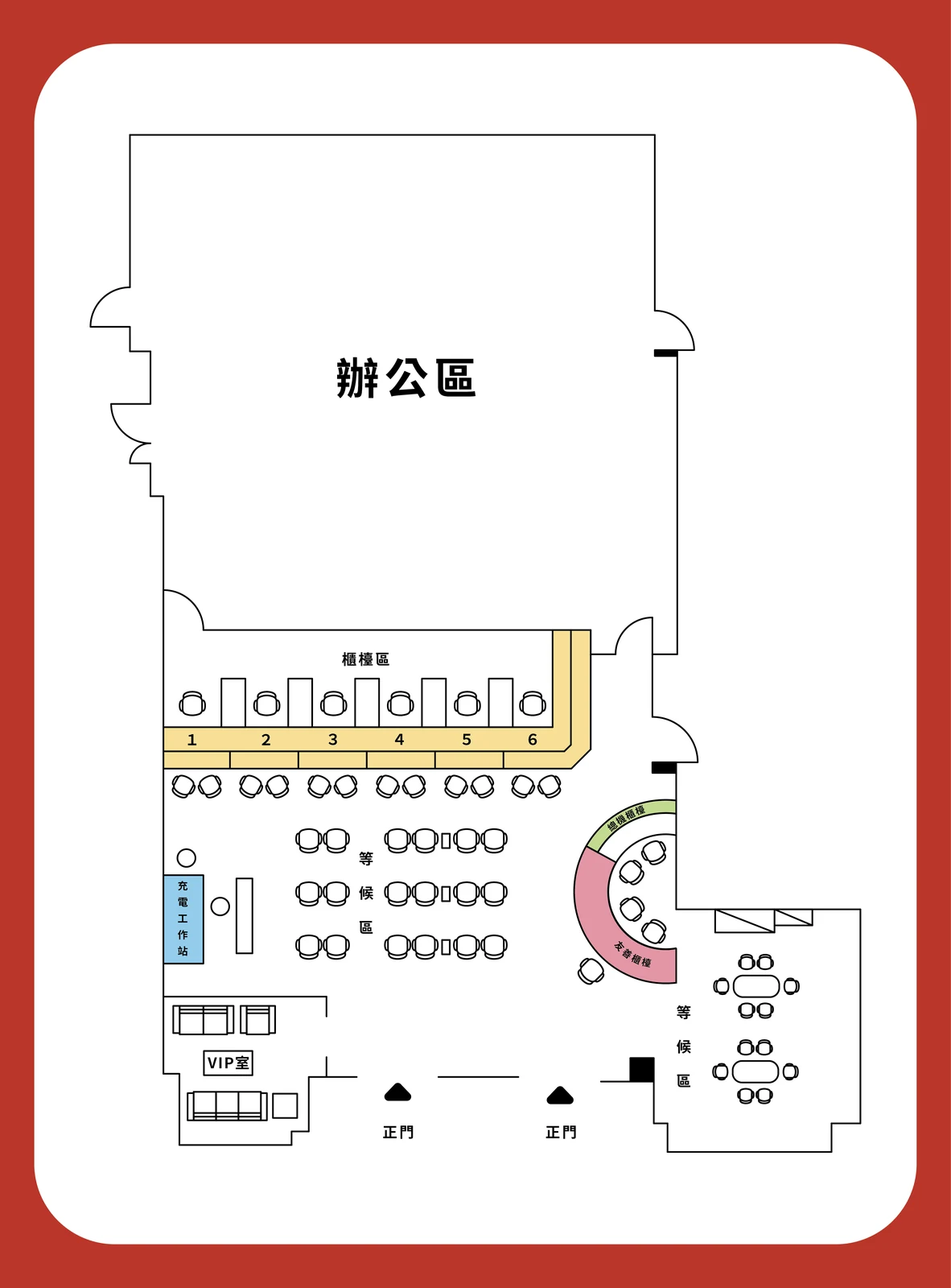
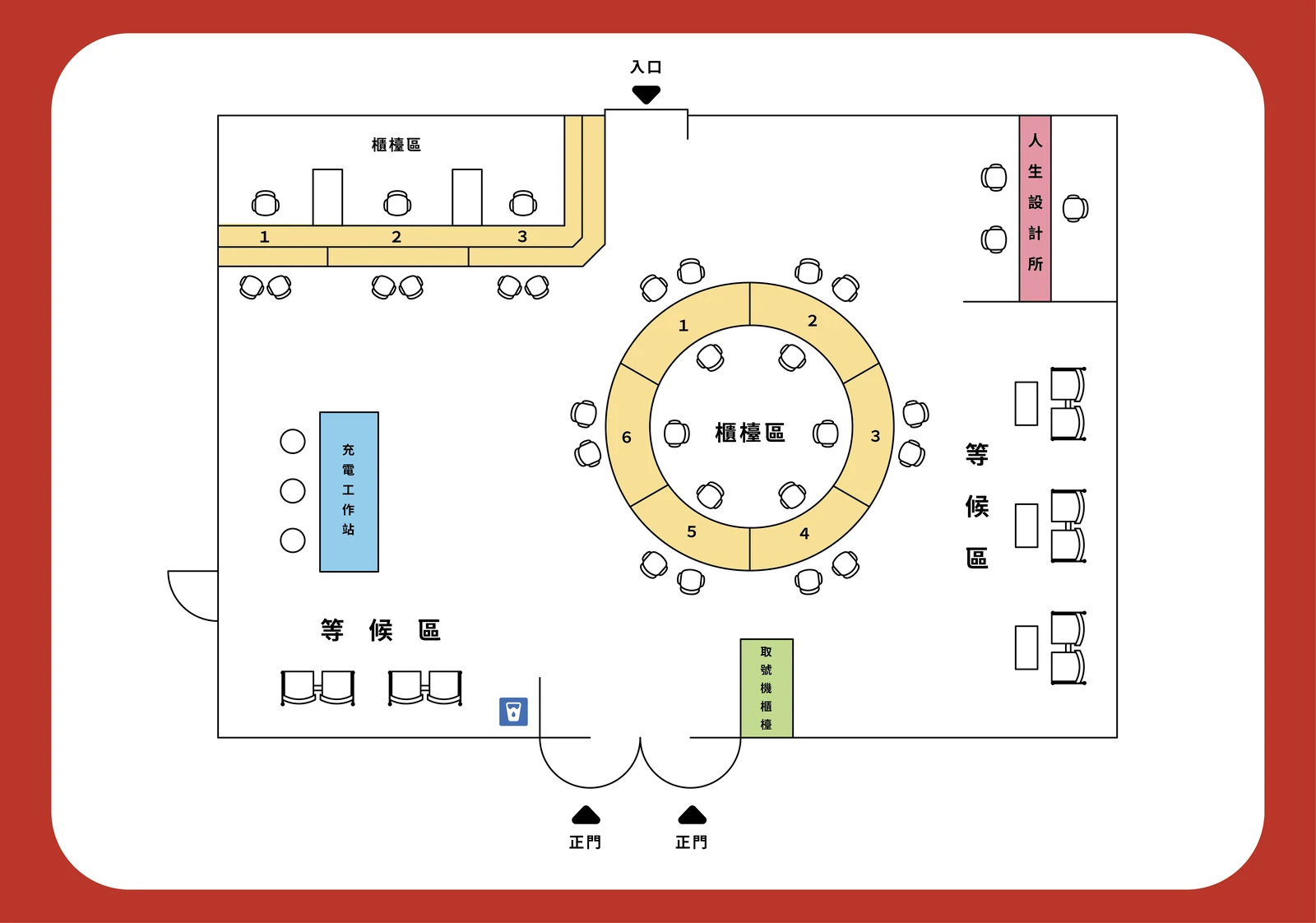
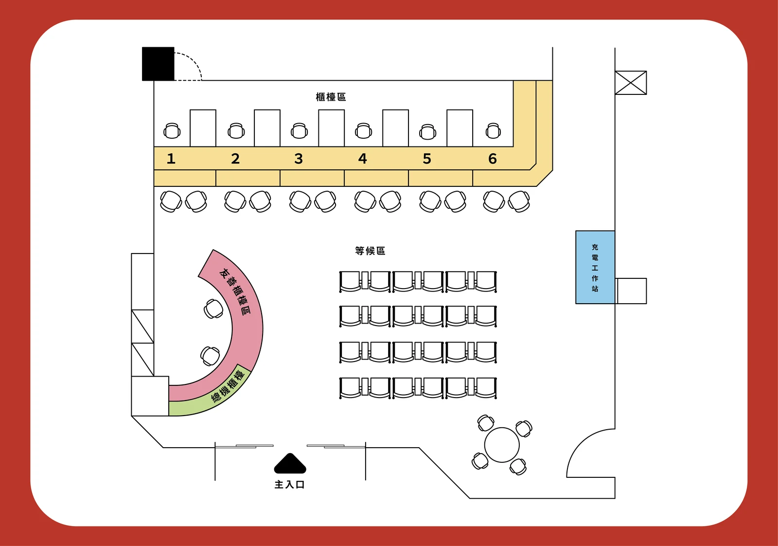
Customer-floor guidance maps for four branch buildings of a life insurance company, drawn to one shared visual system across four different floor plans. Each carries the numbered service counters, waiting areas, ticket machines and charging stations, and a colour-coded key for the accessible toilet, water fountain and ATM.
Event guidance
For a community Christmas event, I drew a guidance map so visitors could find their way around the venue. I illustrated the site as a flat plan with one bold path running through it, marked each activity point with its own icon, and set the session times along the bottom as plain running text.
Icons do the work text can't here. Someone glancing at this while walking should be able to match a picture to a place without reading a legend first.
Making quiet emotions visible.
Personal series exploring intimacy, behaviour and the details that hold a story
Grandmother
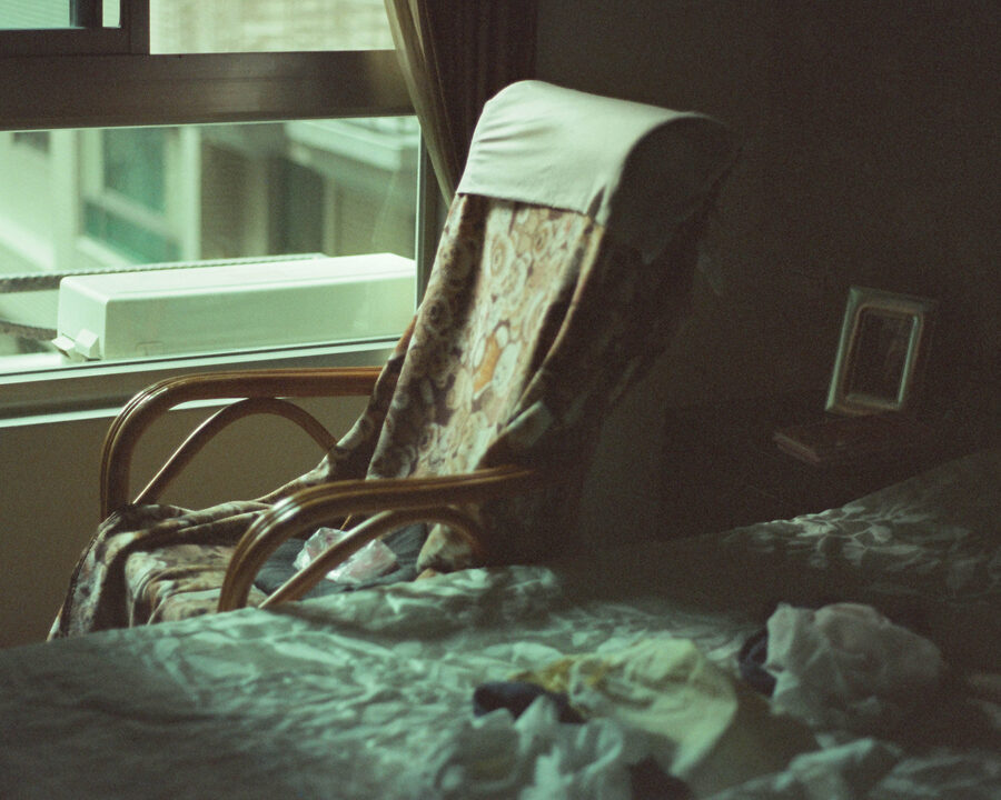
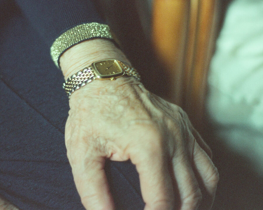
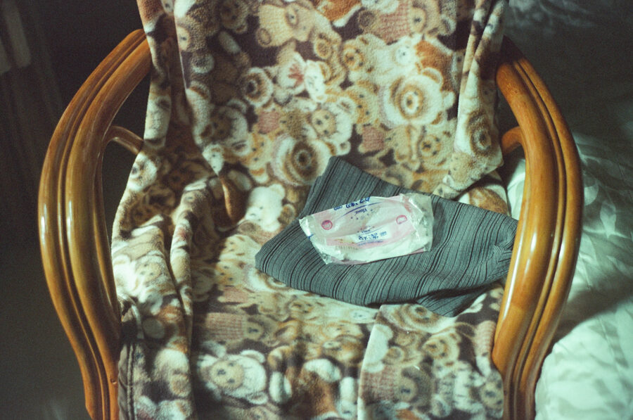
A quiet series about my grandmother, made in the rooms and details of her everyday life — the chair by the window, the watch worn every day, the bed left mid-morning and the light she sat in.
I keep returning to the series because it avoids the familiar extremes of how older people are pictured. The camera stays close, patient and attentive, allowing her presence to carry the story.
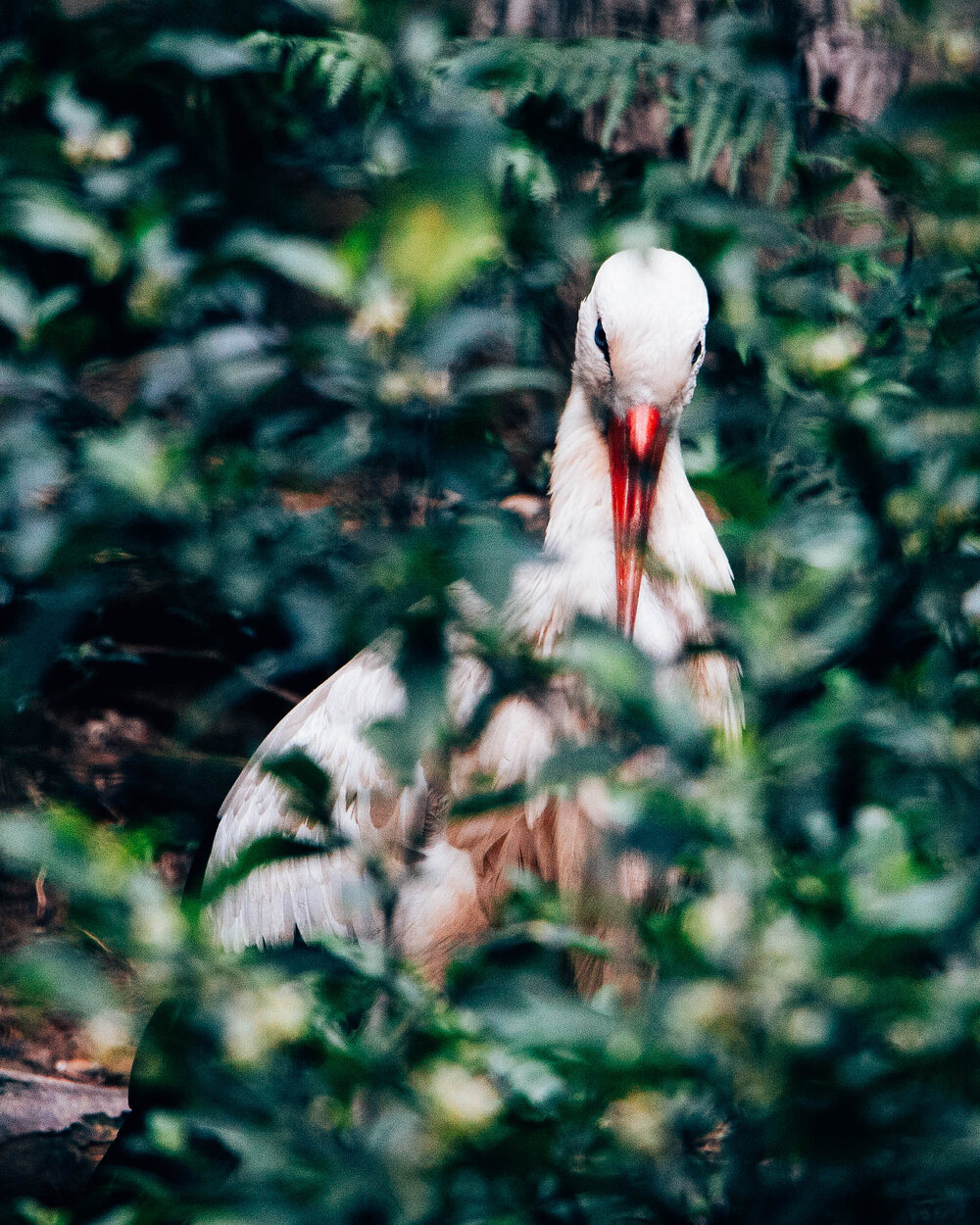
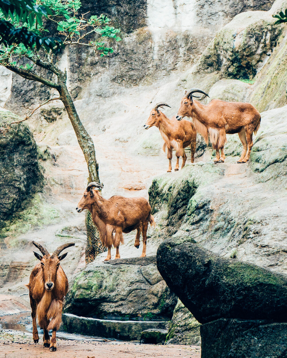
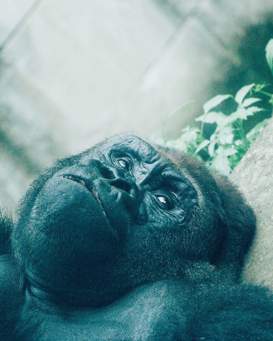
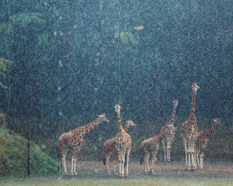
Happy Zoo
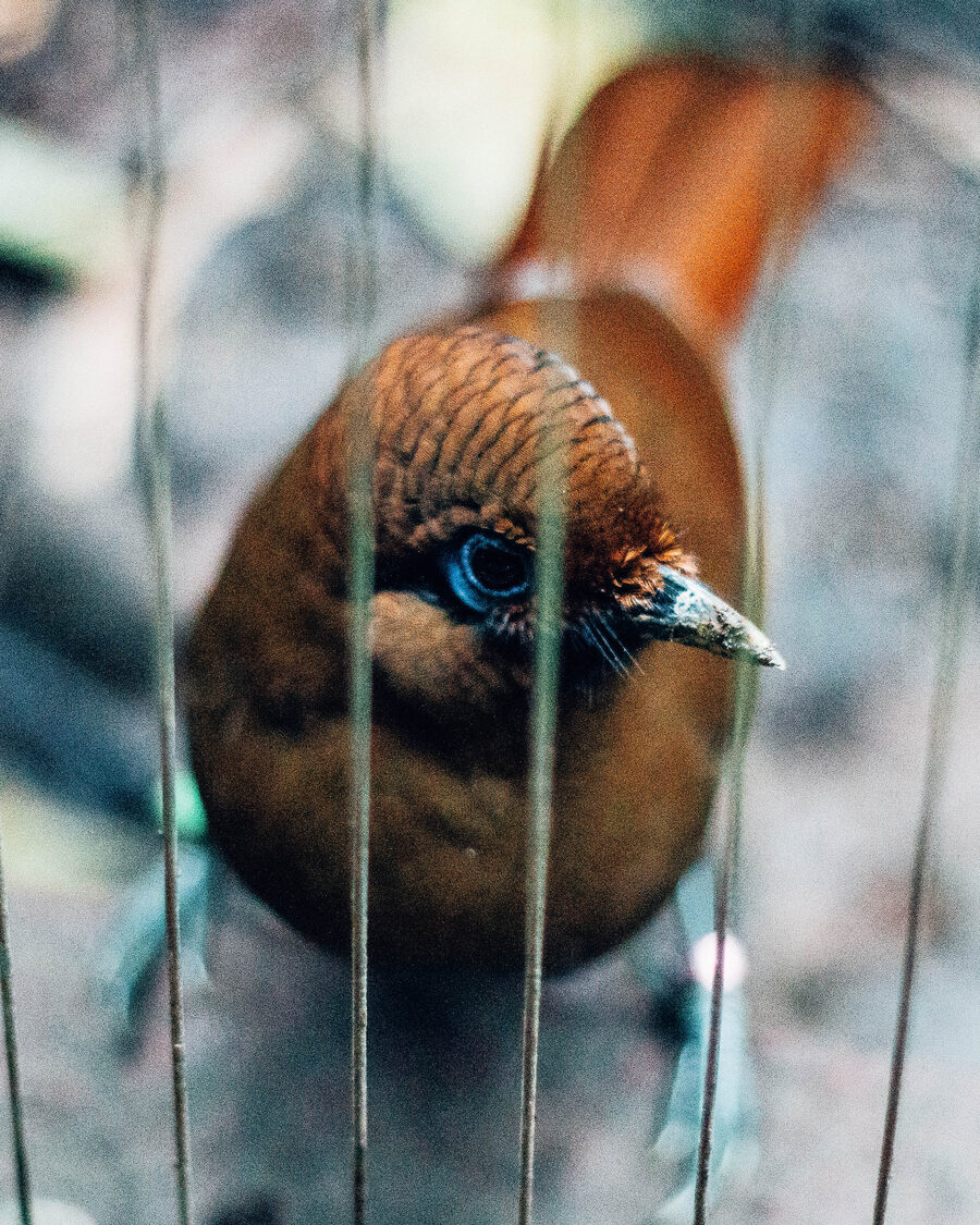
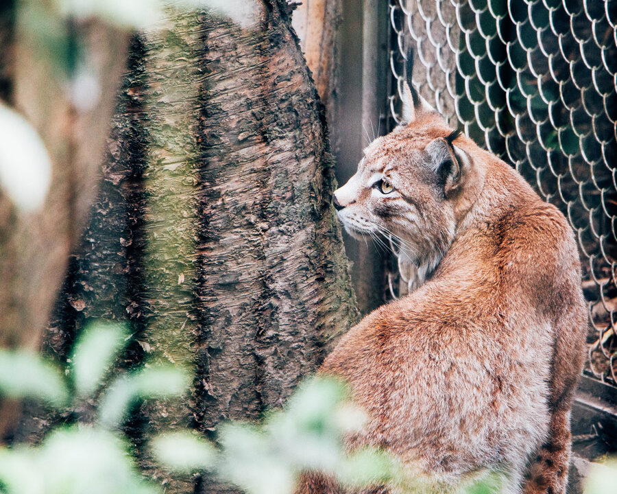
An ongoing series made over many visits to Taipei Zoo and Australia Zoo in Queensland — going often, slowly, watching how the animals actually are inside the lives we've built for them.
What I keep looking for is in the eyes and the small behaviours: sometimes something that reads as sadness, sometimes a stillness that looks like ease, occasionally something close to contentment. I don't arrive with a verdict about whether zoos should exist — I'm trying to look honestly, and to notice the moments where an animal's state feels unexpectedly familiar.